Mastering Flexbox in 2023: A Comprehensive Guide to Responsive Web Design
3 Min Read

Ever faced challenges when trying to align elements on a webpage? You’re not alone. It’s a common hurdle for many developers. But there’s a solution: Flexbox. Born from the CSS3 specification, Flexbox offers a more efficient and straightforward way to design layouts.
Why Flexbox?
Flexbox simplifies web design. It allows you to organize, align, and distribute space among items in a container, even if their sizes are dynamic or unknown. It’s an essential tool that makes creating responsive and cohesive designs easier.
Kickstarting with Flexbox
To harness the power of Flexbox, set an element’s display property to flex.
.container{
  display: flex;
};
And thats it, now you’re able to use flexbox in that element as a container, and in his childrens, as items.
Flexbox Fundamentals
Flexbox is structured around two core components: the flex container and the flex items. In the following example the container is highlighted in color blue and the items in red:

Flexbox Anatomy
Flexbox introduces a paradigm shift in layout thinking. It emphasizes a main axis and a cross axis, moving away from the conventional block and inline flow.
- Main Axis: Typically runs horizontally across the container.
- Cross Axis: Generally extends vertically.
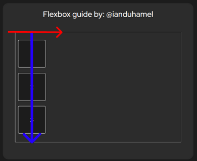
In a horizontal layout (flex-direction: row;), the main axis is horizontal, and the cross axis is vertical. Conversely, in a vertical layout (flex-direction: column;), the main axis is vertical, and the cross axis is horizontal.

In this column direction example its show in blue the main axis and in red the cross axis.
Positioning Items Along the Main Axis
The justify-content property dictates the alignment of items along the main axis. Here are some of its values:
- flex-start: Items align at the container’s start.
- flex-end: Items align at the container’s end.
- center: Items are centered.
- space-between: Even distribution; first item at the start, last at the end.
- space-around: Even distribution with equal spacing around items.
- space-evenly: Uniform distribution of spacing between items and edges.
Positioning Items Along the Cross Axis
The align-items property determines the alignment of items along the cross axis:
- stretch: Items stretch to fill the container (requires no set height).
- flex-start: Items align at the container’s start.
- flex-end: Items align at the container’s end.
- center: Items are centered.
- baseline: Items align at their baseline.
Flex Direction
The flex-direction property sets the orientation of the main and cross axes:
- row: Main axis is horizontal; cross axis is vertical.
- row-reverse: Like row, but reversed.
- column: Main axis is vertical; cross axis is horizontal.
- column-reverse: Like column, but reversed.
Sizing Flex Items
Flexbox offers robust properties to control item sizing:
- flex-grow: Determines how much a flex item grows relative to others.
- flex-shrink: Determines how much a flex item shrinks relative to others.
Gap
The gap property in CSS is shorthand for row-gap and column-gap, defining the spacing between rows and columns in grid and flex layouts.
It has to be declared on the container, and specifies the distance between childrens.
.container{
  display: flex;
  gap: 2rem;
};
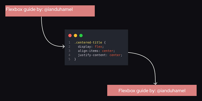
A really practical use-case: Centering a Title
Flexbox makes centering elements both horizontally and vertically a cinch:

Bonus track: A game!
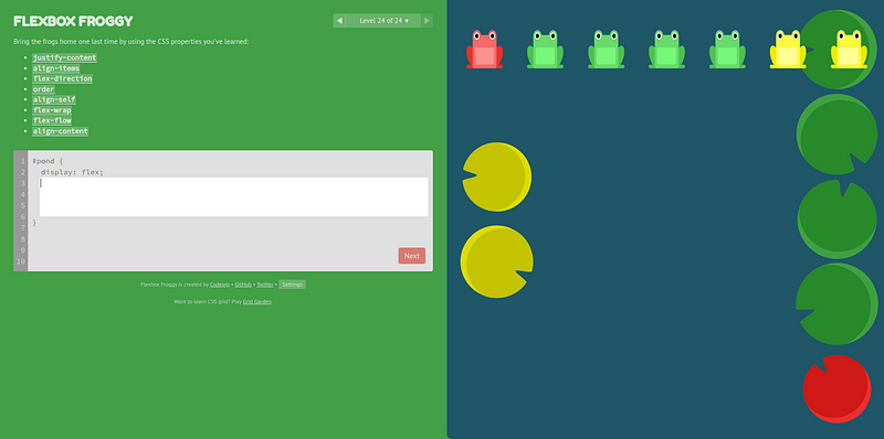
I encourage you to practice what you’ve learned here using the awesome game of Flexbox Froggy, which is a free educational game.

If you play it I hope you will find it a lot of fun, because without realizing it you can probably solve problems like this with only 3 or 4 lines of flexbox code. Which are really complex layout problems to solve in a simple and fast way.
Conclusion
Flexbox has become a fundamental tool in modern web design. It simplifies the challenges of creating layouts and enhances responsive design. As you continue to explore Flexbox, keep practicing and trying out new ideas. Don’t forget to share your work and learnings with others!
As always, I’ll continue to share more insights and experiences in the exciting world of JavaScript. To join me on this journey:
Let’s continue exploring the vast universe of coding together. Happy coding! 😃